
Perché uno sfondo bianco fa ancora vendere di più
I marketplace lo premiano, gli acquirenti lo notano più rapidamente e il prodotto smette di fare concorrenza al proprio tavolo da cucina.
Questo articolo è stato tradotto automaticamente. L'originale in inglese è quello che abbiamo scritto noi.
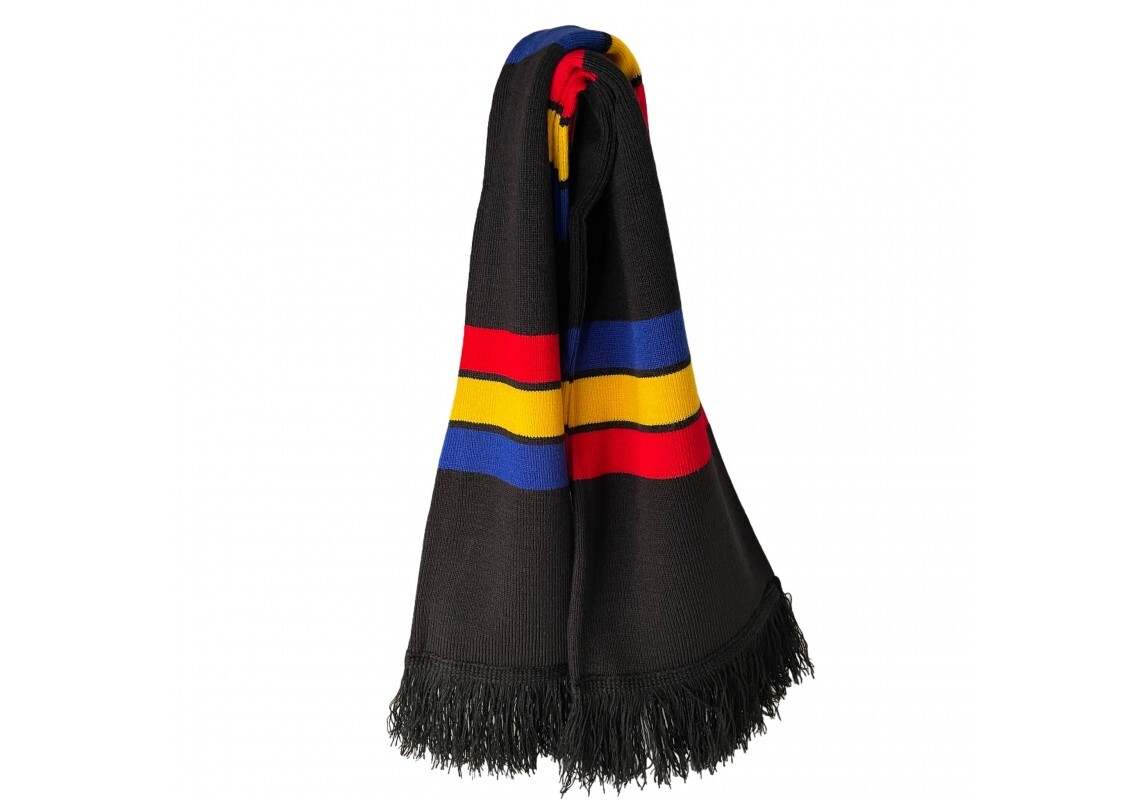
Quasi tutte le piattaforme di vendita online in Europa — eMAG, Allegro, Amazon, Bolt Food per i prodotti pronti — richiedono che l’immagine principale abbia uno sfondo semplice oppure, senza dirlo apertamente, le danno un posizionamento migliore. Non si tratta di una preferenza estetica, bensì di un problema di scansione.
Un acquirente che naviga al telefono dedica alla griglia dei risultati un tempo compreso tra i due e i cinque secondi. In quel lasso di tempo non sta valutando il tuo prodotto, ma sta scartando le opzioni. Qualsiasi elemento che crei “rumore visivo” — un piano di lavoro, una mano, il riflesso di una finestra — ti costa una frazione di secondo, e quella frazione di secondo è tutto ciò che hai a disposizione.
La controargomentazione è fondata: un ritaglio bianco non fornisce all’acquirente alcuna informazione sulle proporzioni o sul contesto. Ecco perché l’immagine principale e la galleria svolgono funzioni diverse. Inizia con l’inquadratura pulita per far risaltare l’immagine nella griglia, poi usa le immagini dalla numero due alla numero cinque per la scena di vita quotidiana, il riferimento alle proporzioni e il primo piano dei dettagli.
Quello che non faremo è falsificare l'etichetta. Se il testo stampato sul prodotto risulta distorto quando correggiamo l'angolazione, rifacciamo lo scatto da quella angolazione oppure manteniamo l'immagine originale. Un acquirente che riceve un prodotto che non corrisponde alla foto comporta un rimborso, una recensione negativa e una penalizzazione nella classifica — il che costa molto di più di quanto sia costato lo scatto stesso.